As I delve into this world of data science I am finding more and more that my sweet spot is in data visualization. It’s really just a fancy way of explaining how to communicate the story the data is telling you. The key is that to do this effectively it has to be visual.
And making it visual is not about making it look pretty. Far from it, it’s about clarity.
The ability to take a complex data set and break it down into something that not only digestible but truly informative is where I’m most interested in expanding my skill set.
And here’s a scary fact:
Which means data scientists have their work cut out for them.
(Actually, it means, we need to raise the bar for basic data literacy, but I digress)
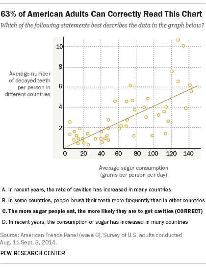
Here are the basics: This is a scatterplot. It shows the correlation between the two variables:
- The average number of decayed teeth per person in different countries
- The average sugar consumption (grams per person per day)
Here’s the correlation: as sugar consumption goes up, so does the number of decayed teeth.
The dots on the chart represent each point of data and the line is called the ‘line of best fit’ or the ‘trend line’. According to MathIsFun.com the trend line is a “line as close as possible to all points, and as many points above the line as below”.
Because the line is a diagonal going up from left to right we would call this a ‘positive’ correlation. As the value of one variable increases so does the other. If one variable went up and the other went down we would consider that a ‘negative’ correlation.
Now while we can see that there is a correlation here, we must remember one of the basic rules of statistics. Correlation does not equal causation. So we can not infer that eating lots of sugar will cause cavities by this chart alone. But it does give us a clue!
This chart above is a good example of the pros of a scatter plot and when it is best used to visualize data. Let’s look at a poor example from visual.ly:

The ‘cylinders’ variable is what we’d call categorical, meaning that each number represents a category. There can be no data points between categories so all of the points end up on straight lines stacking up. It’s hard to even tell how many points there are so, visually we can not clearly see what the correlation is if there is any at all.
It’s important that we use the right visualizations for our data findings to relay them in a way that not only makes sense but gets our point across to the audience, whether that is in the research stage or when presenting.